2026 Color Trends: Top 3 Hues for U.S. Lifestyle Products
The world of design is in constant flux, a dynamic interplay of societal shifts, technological advancements, and evolving human desires. Predicting the future of color is not merely an aesthetic exercise; it’s a strategic imperative for brands, designers, and manufacturers aiming to resonate with consumers. As we cast our gaze forward to 2026, a clear vision of the dominant color palette begins to emerge, particularly within the vast and influential U.S. lifestyle product market. This forecast delves deep into the cultural undercurrents and emerging trends to identify three pivotal hues that will define the aesthetic landscape of everything from home goods and fashion to technology and automotive interiors.
Understanding these 2026 color trends is crucial for anyone involved in product development, marketing, or design. Color influences mood, perception, and purchasing decisions, acting as a silent communicator of brand values and consumer aspirations. Our analysis suggests a move towards a palette that balances tranquility with vibrant expression, reflecting a society grappling with complexity while seeking comfort and authenticity. The three dominant hues we’ve identified are not just standalone shades; they represent broader emotional and psychological themes that will shape consumer preferences across the United States.
The Art and Science of Color Forecasting: Unveiling 2026 Color Trends
Color forecasting is a sophisticated discipline that combines art, science, and a keen understanding of global socio-economic factors. It’s not about arbitrary choices but rather a meticulous process of observing cultural shifts, technological innovations, and consumer behavior. For the 2026 color trends, our methodology involved analyzing a wide array of inputs: runway shows, interior design exhibitions, automotive concept designs, technological advancements, social media trends, and even geopolitical events. These diverse data points coalesce to reveal patterns and emerging preferences that will dictate the colors of tomorrow.
The U.S. lifestyle product market is particularly sensitive to these shifts. Consumers are increasingly discerning, seeking products that not only serve a functional purpose but also align with their personal values and aesthetic sensibilities. Color plays a vital role in this alignment. A color that feels outdated or irrelevant can quickly diminish a product’s appeal, while a trend-forward hue can catapult it into desirability. Therefore, anticipating the 2026 color trends is not just about being fashionable; it’s about being relevant and competitive in a crowded marketplace.
Our forecast for 2026 points to a confluence of desires: a yearning for nature and grounding, an appreciation for understated luxury, and a renewed optimism for the future. These desires manifest in specific color families that we believe will dominate. Let’s explore these three dominant hues and the cultural narratives they embody, offering a comprehensive guide for navigating the aesthetic landscape of 2026.
Advertisements
The journey to identifying these dominant hues begins with a deep dive into global macro trends. We consider the impact of environmental concerns, the ongoing digital transformation, shifts in work-life balance, and evolving concepts of wellness. Each of these macro trends leaves an indelible mark on our collective psyche, which in turn influences our color preferences. For example, a heightened awareness of climate change often translates into a desire for natural, organic, and earthy tones, reflecting a connection to the environment. Conversely, rapid technological advancements can inspire futuristic, metallic, or vibrant digital hues.
Furthermore, the cyclical nature of fashion and design cannot be overlooked. While innovation is key, there’s often a nostalgic element, where past trends are reinterpreted through a contemporary lens. Understanding these cycles, combined with forward-looking analysis, allows us to paint a more accurate picture of what’s to come. The goal is not just to name colors but to understand their context, their emotional resonance, and their potential applications across various product categories. This holistic approach ensures that our 2026 color trends forecast is not only predictive but also actionable for businesses and creatives alike.
Dominant Hue 1: Verdant Calm – The Embrace of Nature and Well-being
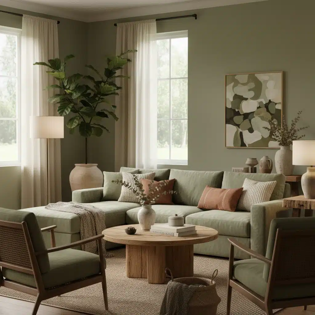
The first dominant hue for 2026 is what we’re calling ‘Verdant Calm’ – a sophisticated, muted, and earthy green. This isn’t the bright, energetic green of spring, nor the deep, mysterious green of a dense forest. Instead, Verdant Calm is a soft, almost sage-like green, infused with subtle grey undertones, evoking a sense of tranquility, stability, and a deep connection to nature. It represents a collective desire for well-being, mindfulness, and a return to simpler, more authentic living.
The Psychology Behind Verdant Calm
In a world increasingly characterized by digital overload and constant connectivity, there’s a growing yearning for respite and grounding. Verdant Calm speaks to this need. Green is inherently associated with nature, growth, and renewal. When muted and softened, it takes on a calming, restorative quality. This hue encourages introspection and a sense of peace, making it perfect for environments and products designed to foster relaxation and mental clarity. It’s a color that reassures, offering a quiet antidote to the stresses of modern life.
The widespread adoption of Verdant Calm signifies a broader cultural movement towards sustainability and holistic living. Consumers are increasingly prioritizing products that are not only aesthetically pleasing but also ethically produced and environmentally friendly. This hue, with its inherent connection to nature, aligns perfectly with these values, making it a powerful choice for brands committed to conscious consumption. It’s a color that doesn’t shout for attention but rather whispers a promise of peace and harmony, resonating deeply with those seeking balance in their lives. The versatility of Verdant Calm also allows it to pair beautifully with a range of other natural tones, from warm beiges and creams to rich browns and subtle grays, creating cohesive and inviting palettes.
Applications Across Lifestyle Products
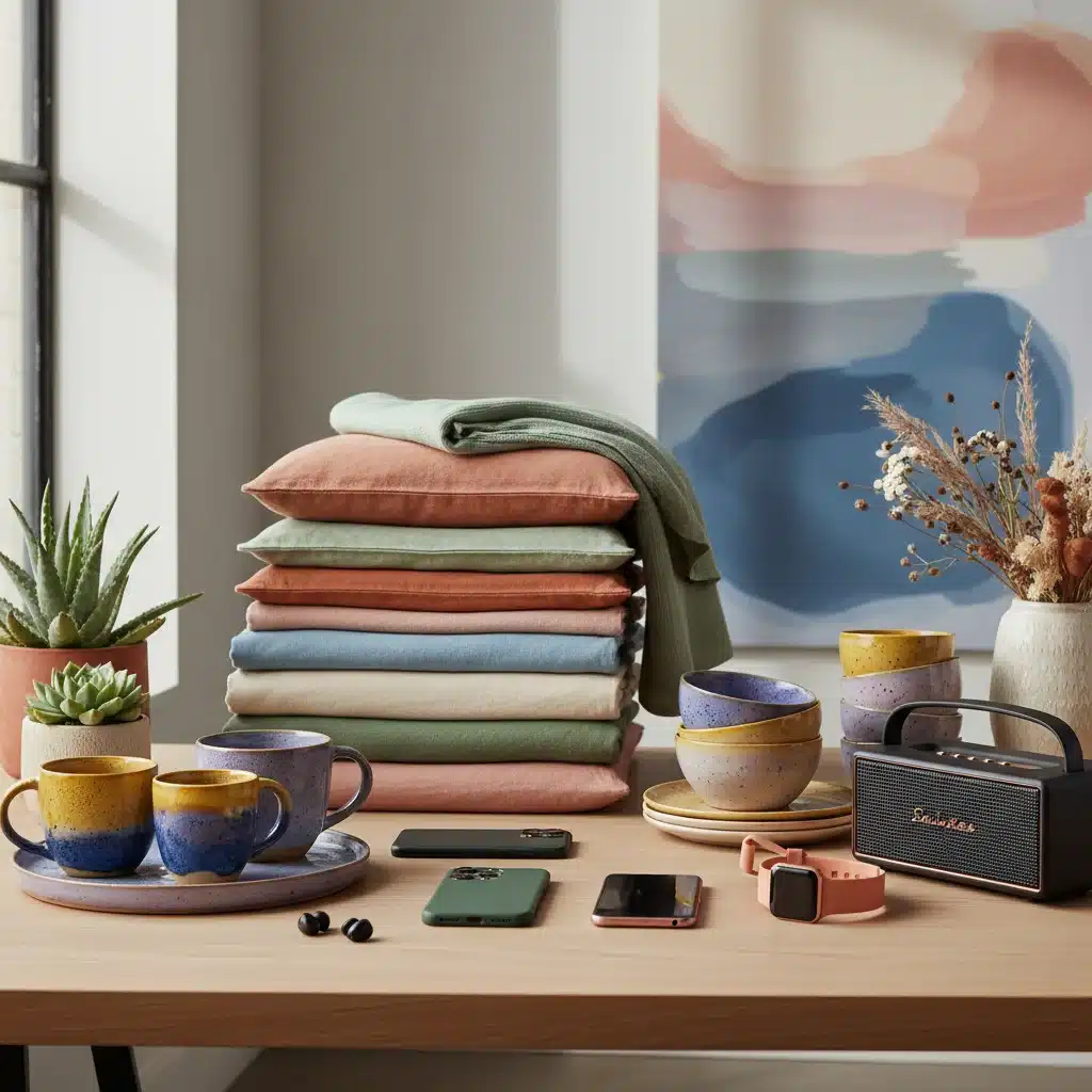
Verdant Calm will be ubiquitous across various U.S. lifestyle products in 2026. In home décor, expect to see it on accent walls, upholstery, ceramic tableware, and bedding, transforming living spaces into serene sanctuaries. Furniture pieces in this shade will exude understated elegance. In fashion, Verdant Calm will appear in sustainable clothing lines, casual wear, and accessories, reflecting a conscious consumer’s preference for natural fibers and timeless aesthetics. Technology, too, will embrace this hue, with devices and accessories adopting a softer, more organic look, blurring the lines between nature and innovation. Even in automotive interiors, this green will offer a sense of calm and sophistication, elevating the driving experience.
Dominant Hue 2: Luminous Ochre – A Touch of Warmth and Optimism
Our second dominant hue for the 2026 color trends is ‘Luminous Ochre’ – a warm, inviting, and subtly golden yellow-brown. This isn’t a bright, primary yellow, but rather a sophisticated, sun-baked shade reminiscent of ancient pigments and artisanal craftsmanship. Luminous Ochre radiates warmth, optimism, and a sense of enduring quality, reflecting a desire for comfort, authenticity, and a positive outlook on the future.
The Psychology Behind Luminous Ochre
Yellows and browns often evoke feelings of warmth, comfort, and stability. Luminous Ochre, with its golden undertones, adds an element of subtle luxury and quiet confidence. It’s a color that feels both grounding and uplifting, offering a sense of hope and creativity. In times of uncertainty, colors that provide a sense of security and optimism become particularly appealing. Luminous Ochre embodies this balance, offering a comforting presence while subtly encouraging forward-thinking and innovation. It’s a hue that feels lived-in and timeless, yet fresh and inspiring.
Applications Across Lifestyle Products
Luminous Ochre will find its place across numerous U.S. lifestyle products. In home goods, think plush throws, decorative pillows, ceramic vases, and artisanal wooden furniture. It will bring warmth and character to minimalist spaces and complement rustic aesthetics. In fashion, this hue will be prominent in knitwear, outerwear, and accessories, offering a sophisticated alternative to traditional neutrals. It will also appear in leather goods, adding a rich, natural patina. For technology, Luminous Ochre will be used in subtle accents or textured finishes, providing a tactile and inviting feel to gadgets. Its versatility makes it an excellent choice for branding, conveying a sense of heritage, quality, and approachability.
The appeal of Luminous Ochre also stems from its ability to evoke a sense of global connection and cultural richness. Its roots in natural pigments used across various ancient civilizations give it a timeless quality that transcends fleeting trends. As consumers continue to seek unique, handcrafted, and story-rich products, Luminous Ochre provides a perfect backdrop for these narratives. It pairs beautifully with natural materials like wood, terracotta, and linen, enhancing their inherent beauty and creating a harmonious, inviting aesthetic. This hue is a testament to the enduring power of warm, earthy tones to create spaces and products that feel both luxurious and welcoming, perfectly aligning with the broader 2026 color trends of authenticity and well-being.
Dominant Hue 3: Electro Violet – The Spark of Innovation and Self-Expression
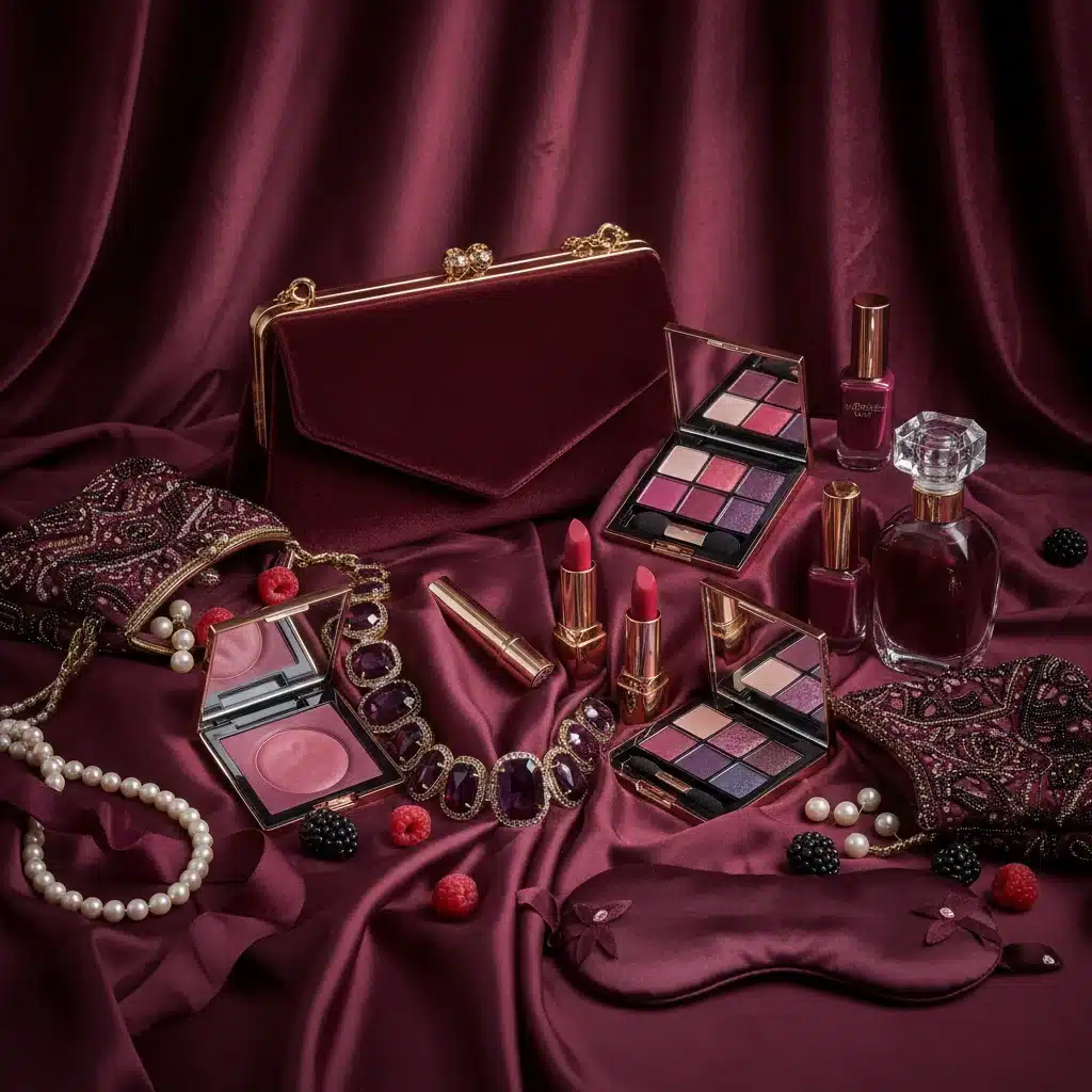
The third dominant hue for 2026, ‘Electro Violet,’ introduces a dynamic and forward-thinking element to the palette. This is a vibrant, almost electric shade of purple, infused with a subtle blue luminescence. It’s bold, futuristic, and unapologetically expressive, representing innovation, creativity, and a desire for individuality and digital exploration. Electro Violet signifies a shift towards embracing the exciting possibilities of technology and the freedom of self-expression in a rapidly evolving world.
The Psychology Behind Electro Violet
Purple, historically associated with royalty and luxury, also carries connotations of mystery, spirituality, and creativity. Electro Violet amplifies these qualities with a modern, energetic twist. It’s a color that stimulates imagination and encourages experimentation. In a post-pandemic world, there’s a renewed desire for joy, vibrancy, and a break from the mundane. Electro Violet provides that spark, appealing to those who embrace change, celebrate individuality, and are excited by technological advancements and digital frontiers. It’s a color that stands out, making a statement without being overtly aggressive.
Applications Across Lifestyle Products
Electro Violet will make a striking impact across various U.S. lifestyle products. In fashion, expect to see it in activewear, streetwear, and statement accessories, reflecting a playful yet sophisticated approach to personal style. It will also be prominent in beauty products, from eyeshadows to nail polishes, catering to consumers eager for bold self-expression. Technology will be a key domain for Electro Violet, appearing on smartphones, gaming consoles, smart devices, and virtual reality accessories, signifying innovation and cutting-edge design. In home décor, it might be used as a vibrant accent color in art pieces, lighting fixtures, or small decorative objects, adding a pop of energy to more neutral spaces. Its energetic nature makes it ideal for products aimed at younger demographics and those who appreciate a futuristic aesthetic.
The emergence of Electro Violet as a dominant hue underscores the growing influence of digital culture and virtual realities on our physical world. As metaverse experiences become more prevalent and AI continues to reshape our lives, colors that reflect this technological frontier will gain traction. Electro Violet is not just a color; it’s a symbol of digital transformation and the limitless possibilities it presents. It contrasts beautifully with the grounding qualities of Verdant Calm and Luminous Ochre, creating a balanced yet exciting palette for 2026. This juxtaposition allows for versatile design applications, catering to a wide range of consumer preferences while ensuring products remain relevant and captivating. The boldness of Electro Violet also speaks to a desire for optimism and a celebration of human ingenuity, making it a pivotal shade in the upcoming 2026 color trends.
Interplay and Harmony: Crafting a Balanced 2026 Palette
While each of these three dominant hues – Verdant Calm, Luminous Ochre, and Electro Violet – holds significant individual power, their true potential is unlocked when considered as part of a cohesive 2026 color trends palette. The beauty of this forecast lies in the harmonious contrast and complementary nature of these shades. Verdant Calm offers grounding and serenity, Luminous Ochre provides warmth and optimism, and Electro Violet injects a dose of innovation and vibrant energy. Together, they form a balanced and versatile palette that can cater to a wide spectrum of consumer tastes and product categories.
Designers and brands can leverage this interplay in various ways. For instance, a product might feature a primary color of Verdant Calm, with subtle accents of Luminous Ochre for warmth and a touch of Electro Violet for a modern edge. Or, a collection could explore different facets of the palette, with some items leaning heavily into the natural tones and others embracing the futuristic vibrancy. This flexibility allows for creative freedom while ensuring products remain aligned with the overarching aesthetic of 2026.
Strategic Implementation for Brands
For brands operating in the U.S. lifestyle product market, understanding these 2026 color trends is critical for strategic planning. It informs everything from seasonal collections and product launches to marketing campaigns and brand identity refreshes. Incorporating these dominant hues can help products feel fresh, relevant, and highly desirable to consumers. It’s not about blindly following trends, but about intelligently integrating them to enhance product appeal and market positioning.
Consider the emotional impact each color carries and how that aligns with your brand’s message. If your brand emphasizes sustainability and wellness, Verdant Calm might be your hero color. If you aim to convey warmth, comfort, and authenticity, Luminous Ochre could be central. For brands focused on innovation, technology, and youthful energy, Electro Violet offers a compelling choice. The most successful strategies will likely involve a thoughtful combination, allowing brands to tell a richer, more nuanced story through their color choices.
Furthermore, the application of these colors extends beyond the product itself. Packaging, retail environments, digital interfaces, and advertising collateral should all reflect these emerging trends to create a cohesive and immersive brand experience. A unified visual language, rooted in the predicted 2026 color trends, will resonate more deeply with consumers, fostering brand recognition and loyalty.
Looking Beyond 2026: The Evolving Landscape
While our focus is on the immediate horizon of 2026, it’s important to remember that color trends are part of a larger, continuous evolution. The themes that give rise to Verdant Calm, Luminous Ochre, and Electro Violet – the pursuit of well-being, the appreciation for authenticity, and the excitement for innovation – are deeply rooted and likely to persist in various forms. Future color forecasts will build upon these foundations, introducing new nuances and adaptations as societal values and technological capabilities continue to shift.
Staying attuned to these broader cultural currents is key to long-term success in design and product development. The 2026 color trends offer a snapshot of a particular moment, but the underlying drivers provide insights that extend far beyond a single year. By understanding not just *what* colors will be popular, but *why* they will be popular, brands can develop a more robust and adaptable strategy for the future.
The journey of color is a reflection of humanity’s ongoing story. As we navigate new challenges and embrace new opportunities, our aesthetic preferences will continue to evolve, offering a vibrant and ever-changing canvas for creativity and expression. The 2026 palette is a testament to this dynamic process, providing a compelling vision for the products and environments that will shape our lives in the coming years.
Conclusion: Embracing the 2026 Color Trends for Future Success
The 2026 color trends for U.S. lifestyle products point to a fascinating blend of nature-inspired tranquility, comforting warmth, and electrifying innovation. Verdant Calm offers a grounding presence, Luminous Ochre brings optimistic comfort, and Electro Violet ignites a spark of creativity and futurism. These three dominant hues are not just colors; they are reflections of our collective aspirations, anxieties, and desires as we move further into the decade.
For designers, manufacturers, and marketers, this forecast provides a powerful tool. By strategically integrating these colors into product development, branding, and marketing efforts, businesses can ensure their offerings resonate deeply with consumers. Embracing these trends is about more than just aesthetics; it’s about connecting with the emotional and psychological landscape of the market, fostering relevance, and ultimately driving success.
The future of design is colorful, nuanced, and deeply intertwined with the human experience. As 2026 approaches, those who understand and thoughtfully apply these dominant hues will be best positioned to capture the hearts and minds of consumers, shaping the aesthetic narrative of the lifestyle product market for years to come. Prepare to immerse your creations in the serene greens, warm ochres, and vibrant violets that will define the next wave of design innovation.