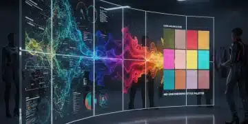
Color Forecast 2026: The 3 Dominant Palettes Influencing US Apparel and Design This Year
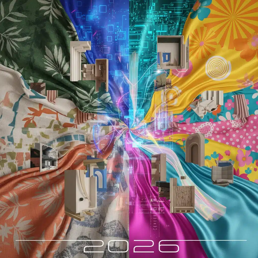
Color Forecast 2026: The 3 Dominant Palettes Influencing US Apparel and Design This Year
The world of color is constantly evolving, reflecting shifts in culture, technology, and our collective consciousness. For designers, brands, and consumers alike, understanding the upcoming 2026 color trends is not just about staying fashionable; it’s about connecting with the zeitgeist and creating products that resonate deeply. As we peer into 2026, a fascinating tapestry of hues is emerging, dominated by three distinct yet interconnected palettes that will profoundly influence US apparel and design.
These 2026 color trends are more than just pretty shades; they are psychological anchors, emotional communicators, and powerful tools for brand identity. From the calming embrace of nature-inspired tones to the electrifying pulse of digital realms and the uplifting spirit of optimistic brights, these palettes encapsulate our desires for balance, innovation, and joy in a rapidly changing world. Let’s dive deep into the three dominant color palettes that will define 2026.
Advertisements
1. Earthy Serenity: The Quest for Grounding and Connection
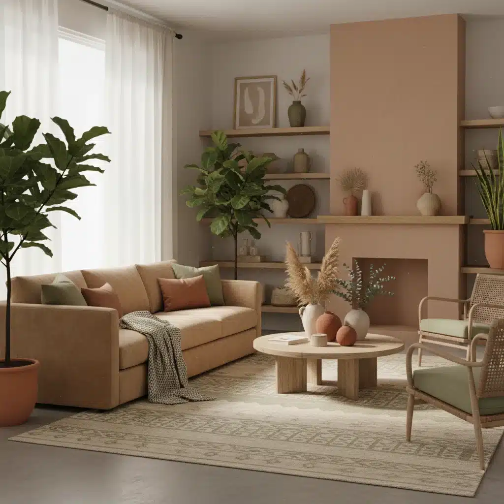
In an increasingly fast-paced and digitized existence, the yearning for tranquility and a return to nature’s embrace is stronger than ever. The ‘Earthy Serenity’ palette directly addresses this need, offering a sanctuary of calm and groundedness. This palette is a sophisticated evolution of past natural trends, moving beyond simple neutrals to incorporate richer, more nuanced shades inspired by the untouched beauty of our planet.
Key Colors within Earthy Serenity:
- Deep Forest Green: A profound, restorative green reminiscent of ancient woodlands. It evokes growth, stability, and a deep connection to ecological well-being. This shade will be prominent in outerwear, home textiles, and even sophisticated evening wear, offering a sense of quiet luxury.
- Warm Terracotta: Moving beyond the rustic, 2026’s terracotta is refined and inviting. It’s a sun-baked, natural clay tone that brings warmth, authenticity, and a touch of artisanal craftsmanship. Expect to see it in knitwear, accessories, and interior accents, providing a comforting, organic feel.
- Sandy Beige/Stone: These are the foundational neutrals of the palette, but with a subtle complexity. They are not stark or cold but imbued with a slight warmth, reflecting natural rock formations and sun-bleached landscapes. They serve as perfect anchors for bolder earthy tones and will be ubiquitous in versatile separates and minimalist design.
- Muted Sage: A softer, more ethereal green than its forest counterpart, sage offers a sense of purification and gentle healing. It’s perfect for creating serene environments and lightweight, breathable apparel that whispers rather than shouts.
- Deep Ochre: A rich, golden-brown hue that adds a touch of ancient wisdom and organic vibrancy. It’s a sophisticated accent color that can elevate a natural scheme, appearing in statement pieces or intricate patterns.
Influence on US Apparel in 2026:
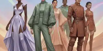
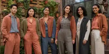
For apparel, ‘Earthy Serenity’ translates into comfortable yet elegant silhouettes. Think oversized knit sweaters in forest green, flowing linen dresses in warm terracotta, and tailored trousers in sandy beige. The emphasis is on natural fibers – organic cotton, linen, hemp, and sustainable wools – reinforcing the connection to nature. Textures will be key, from ribbed knits to brushed surfaces, adding depth and tactility. This palette caters to a consumer seeking longevity, comfort, and understated sophistication, moving away from fleeting trends towards a more mindful wardrobe.
Impact on US Design in 2026:
In interior design, ‘Earthy Serenity’ fosters spaces that are sanctuaries from the outside world. Walls might be painted in muted sage or warm terracotta, complemented by natural wood furniture and stone accents. Upholstery will favor textured fabrics in deep forest greens or sandy tones. The palette encourages biophilic design, integrating plants and natural light to further enhance the sense of calm. For product design, think sustainable materials, ergonomic forms, and a focus on durability and timeless aesthetics. Packaging will embrace recycled materials and minimalist designs, letting the natural hues speak for themselves.
2. Digital Reverie: Exploring the Frontiers of Technology and Fantasy
Contrasting sharply with the natural calm, the ‘Digital Reverie’ palette reflects our growing fascination with the metaverse, artificial intelligence, and the boundless possibilities of digital innovation. This palette is futuristic, ethereal, and often iridescent, blurring the lines between the real and the virtual. It speaks to a generation that navigates digital landscapes as fluidly as physical ones, seeking escapism, wonder, and cutting-edge aesthetics.
Key Colors within Digital Reverie:
- Luminous Lavender: A soft yet striking purple, often with an iridescent or pearlescent quality. It represents creativity, fantasy, and the mystical allure of digital realms. Expect to see it in shimmering fabrics, tech accessories, and avant-garde makeup.
- Cyber Teal: A vibrant, electric blue-green that embodies digital energy and interconnectedness. It’s a dynamic shade that feels both futuristic and refreshing, perfect for activewear, digital interfaces, and conceptual art.
- Metallic Silver/Chrome: These aren’t just accents; they are foundational elements, bringing a sleek, polished, and high-tech feel. From reflective fabrics to hardware details, silver and chrome signify innovation, precision, and a futuristic edge.
- Holographic White: A white that isn’t truly white, but rather a translucent, shimmering hue that catches light and reflects a spectrum of subtle colors. It’s about light manipulation and the illusion of depth, ideal for innovative textiles and architectural elements.
- Deep Indigo/Violet: Providing depth and grounding to the otherwise airy palette, these darker shades evoke the vastness of space and the mysteries of technology. They offer a sophisticated contrast and can be used to create dramatic effects in apparel and digital interfaces.
Influence on US Apparel in 2026:
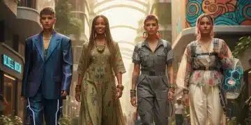
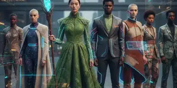
Apparel in the ‘Digital Reverie’ palette will feature innovative fabrics and daring silhouettes. Iridescent materials, reflective surfaces, and translucent layers will be common. Sportswear will merge with high fashion, incorporating technical fabrics in cyber teal and luminous lavender. Accessories will be sleek and sculptural, often with metallic finishes. This trend caters to a consumer who is tech-savvy, experimental, and unafraid to express individuality through bold, forward-thinking fashion. Think augmented reality filters influencing physical garment designs, and clothing that interacts with light in dynamic ways. The emphasis is on performance, innovation, and a visual spectacle that transcends traditional boundaries.
Impact on US Design in 2026:
In design, ‘Digital Reverie’ manifests in minimalist yet impactful spaces. Lighting will be crucial, with LED strips, projection mapping, and smart home technology creating immersive environments. Furniture might incorporate transparent or reflective materials, and digital art installations will be common. For product design, this means sleek gadgets, interactive displays, and products that feel intuitively connected to the digital world. Packaging will be minimalist, often with metallic or holographic finishes, emphasizing the product’s advanced nature. Websites and user interfaces will embrace gradients, glowing elements, and dark mode aesthetics, all while maintaining a user-friendly and visually stimulating experience.
3. Vibrant Optimism: A Celebration of Joy and Energy
After periods of global uncertainty, there’s a palpable desire for joy, spontaneity, and a renewed sense of hope. The ‘Vibrant Optimism’ palette is a direct manifestation of this collective yearning. It’s a celebration of life, expressed through bold, saturated, and often unexpected color combinations. This palette is about breaking free from conventions, embracing individuality, and radiating positive energy.
Key Colors within Vibrant Optimism:
- Electric Coral: A punchy, energetic coral that exudes warmth and playfulness. It’s a confident and joyful hue that demands attention, perfect for statement pieces, swimwear, and bold graphic designs.
- Zesty Lime Green: A bright, almost neon lime that signifies freshness, vitality, and a rebellious spirit. It’s an invigorating color that pairs surprisingly well with other brights or as a powerful accent against neutrals. Expect to see it in activewear, accessories, and youthful branding.
- Sunny Marigold: A cheerful, radiant yellow that brings immediate happiness and warmth. It’s less aggressive than a pure primary yellow, offering a sophisticated sun-kissed glow that is both inviting and uplifting. It will appear in resort wear, home accents, and children’s apparel.
- Sky Blue/Cerulean: A clear, expansive blue that evokes open skies and boundless possibilities. It brings a sense of calm within the vibrancy, acting as a refreshing counterpoint to the warmer tones. It’s versatile for both apparel and broader design applications.
- Hot Pink: Unapologetically bold and feminine, hot pink makes a strong comeback, symbolizing empowerment, passion, and a playful defiance. It’s a high-impact color for fashion statements, beauty products, and pop-art inspired designs.
Influence on US Apparel in 2026:
Apparel in the ‘Vibrant Optimism’ palette will be characterized by color blocking, bold prints, and unexpected combinations. Silhouettes will be playful and expressive, from voluminous skirts to structured jackets in contrasting hues. This trend encourages mixing and matching, allowing individuals to create personalized, high-energy looks. Think vibrant resort wear, statement accessories, and athletic wear designed to turn heads. The consumer for this palette is confident, expressive, and wants their clothing to reflect their positive outlook on life. It’s about making a statement and injecting fun into everyday dressing. We’ll see a resurgence of graphic tees and playful patterns that incorporate these joyful shades.
Impact on US Design in 2026:
In interior design, ‘Vibrant Optimism’ translates to spaces that are stimulating and inspiring. Accent walls in electric coral or zesty lime, combined with playful furniture and art, will create dynamic environments. This palette is perfect for creative studios, children’s rooms, and spaces designed for social interaction. For product design, expect colorful gadgets, playful packaging, and objects that bring a smile. Branding will embrace energetic logos and vibrant advertising campaigns that convey enthusiasm and approachability. Even in corporate environments, subtle touches of these optimistic hues can be used to foster creativity and a positive atmosphere, moving away from dull, uninspiring color schemes.
The Interplay of 2026 Color Trends: Harmony and Contrast
While these three palettes – Earthy Serenity, Digital Reverie, and Vibrant Optimism – each possess a distinct identity, their true power lies in their potential for interplay. Designers in 2026 will not be confined to a single palette but will explore the dynamic contrasts and harmonies between them.
- Earthy Serenity Meets Digital Reverie: Imagine a deep forest green garment with cyber teal stitching or metallic silver hardware. Or a minimalist living space with natural wood and stone, punctuated by a luminous lavender light fixture or a holographic art piece. This combination creates a balance between the organic and the synthetic, the grounding and the ethereal, speaking to our complex relationship with nature and technology. It’s about finding peace in the digital age, or bringing a touch of the future to natural surroundings.
- Digital Reverie Meets Vibrant Optimism: This pairing is about amplified energy and cutting-edge joy. Think a hot pink dress with iridescent panels, or a zesty lime green tech accessory. The vibrant hues provide the emotional punch, while the digital elements add a futuristic, almost otherworldly sheen. This combination is perfect for brands targeting a youthful, avant-garde audience who embraces both technology and bold self-expression. It’s about celebrating the future with exuberance.
- Earthy Serenity Meets Vibrant Optimism: This unexpected duo brings a refreshing twist. A sandy beige blazer paired with an electric coral blouse, or a terracotta vase holding a bouquet of marigold and hot pink flowers. The calming earth tones provide a sophisticated backdrop, allowing the vibrant hues to pop and inject a sense of playful energy without overwhelming. This creates a balanced yet exciting aesthetic, appealing to those who appreciate both timeless elegance and a touch of joyful spontaneity. It’s about grounding vibrancy, making bold colors feel approachable and integrated.
Factors Influencing 2026 Color Trends
Understanding the ‘why’ behind these 2026 color trends is as crucial as knowing the colors themselves. Several macro-level factors are converging to shape these dominant palettes:
Environmental Consciousness:
The urgency of climate change and a growing global awareness of sustainability continue to drive demand for natural aesthetics. ‘Earthy Serenity’ is a direct reflection of this, emphasizing organic materials, sustainable practices, and a desire to reconnect with the natural world. Consumers are increasingly seeking products that are not only beautiful but also environmentally responsible, and color palettes that align with this ethos resonate deeply.
Technological Advancement:
The rapid evolution of AI, virtual reality, and the metaverse is creating entirely new visual languages. ‘Digital Reverie’ captures this futuristic spirit, with its iridescent finishes, glowing effects, and colors that feel otherworldly. As our lives become more intertwined with digital spaces, our aesthetic preferences naturally adapt, leading to a demand for colors that feel both innovative and fantastical. This is not just about gadgets; it’s about a new way of seeing and experiencing the world.
Post-Pandemic Optimism and Resilience:
After years of global challenges, there’s a collective desire for positivity, healing, and celebration. ‘Vibrant Optimism’ serves as an antidote to gloom, offering a burst of energy and joy. People are seeking ways to express happiness, creativity, and a hopeful outlook, and bright, saturated colors provide an immediate and powerful means to do so. This trend reflects a shift towards embracing life’s pleasures and finding joy in self-expression.
Cultural Diversity and Global Influences:
The increasing interconnectedness of cultures through digital platforms is leading to a richer, more diverse tapestry of aesthetic influences. Elements from global art, textiles, and traditional crafts are subtly woven into these modern palettes, adding layers of meaning and appeal. This fusion ensures that the 2026 color trends are not monolithic but rather inclusive and broadly resonant.
Wellness and Mental Health Focus:
The growing emphasis on mental well-being influences design choices significantly. ‘Earthy Serenity’ directly supports this by creating calming, restorative environments. Even ‘Vibrant Optimism’ contributes by offering colors that uplift mood and reduce stress. Color psychology is becoming an even more integral part of design, with intentional choices made to evoke specific emotional responses and support overall wellness.
Leveraging 2026 Color Trends for Your Brand
For businesses, understanding and strategically integrating these 2026 color trends can be a game-changer. Here’s how:
- Product Development: Align your product lines with one or more of these palettes. For apparel, consider new fabrications and silhouettes that enhance the chosen color story. For home goods, think about how these colors can transform living spaces.
- Marketing and Branding: Update your visual branding to reflect current trends. Use these colors in your advertising, social media campaigns, and website design to create a contemporary and relevant image. A fresh color palette can invigorate your brand’s perception.
- Retail and Merchandising: Create compelling in-store displays that showcase products within these palettes. Use lighting and props to enhance the desired mood – whether it’s the calm of ‘Earthy Serenity’ or the energy of ‘Vibrant Optimism’.
- Interior Design Projects: For architects and interior designers, these palettes offer a fresh guide for creating spaces that resonate with future inhabitants, whether residential, commercial, or hospitality.
- Personal Style Evolution: For individuals, these trends provide inspiration to update wardrobes, experiment with new makeup looks, or refresh home decor, ensuring personal style remains current and expressive.
Staying informed about 2026 color trends is more than just following fashion; it’s about anticipating consumer desires, understanding cultural shifts, and strategically positioning your brand or personal aesthetic for future success. These three dominant palettes – Earthy Serenity, Digital Reverie, and Vibrant Optimism – offer a rich spectrum of possibilities, ensuring that 2026 will be a year of dynamic and meaningful color expression across all facets of US apparel and design.
Embrace the calm, explore the future, and celebrate with joy. The colors of 2026 are ready to tell your story.